
Hulu TV + Live

While working at HUGE I was part of an embedded team at Hulu tasked with redesigning their disparate platform experiences to create a unified but flexible new ecosystem. As a Product Designer it was my job to work with Hulu's designers and product managers to develop an interaction model that worked across TV, tablet and mobile devices.
Hardware UX
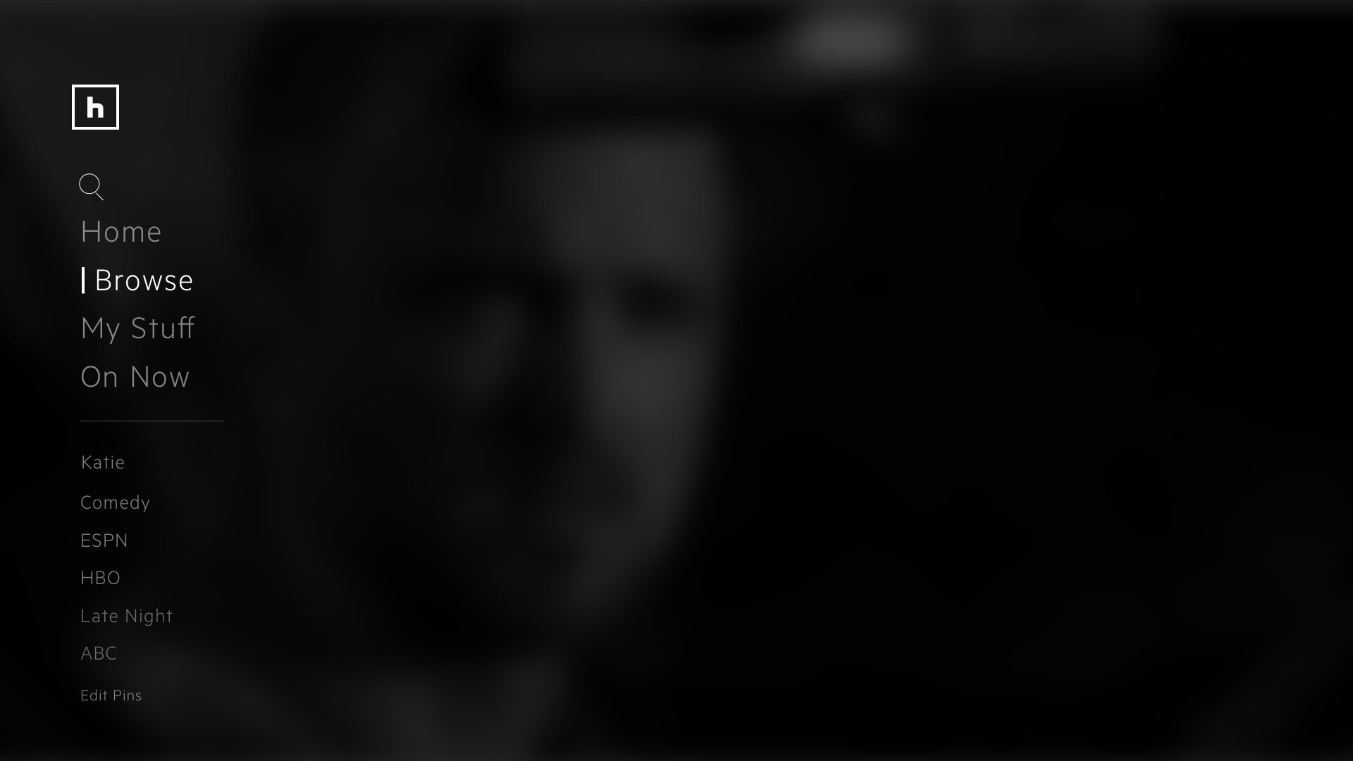
Navigation with modified remote
Navigation with video game controllers
Channel flipping paradigm
Software UX
Unified interaction model
Home theater platform design
Cloud storage interface
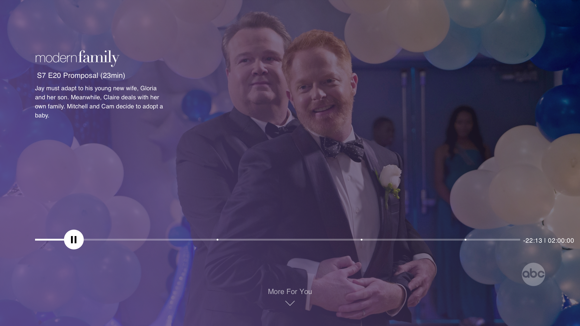
Now playing experience
Areas of Focus
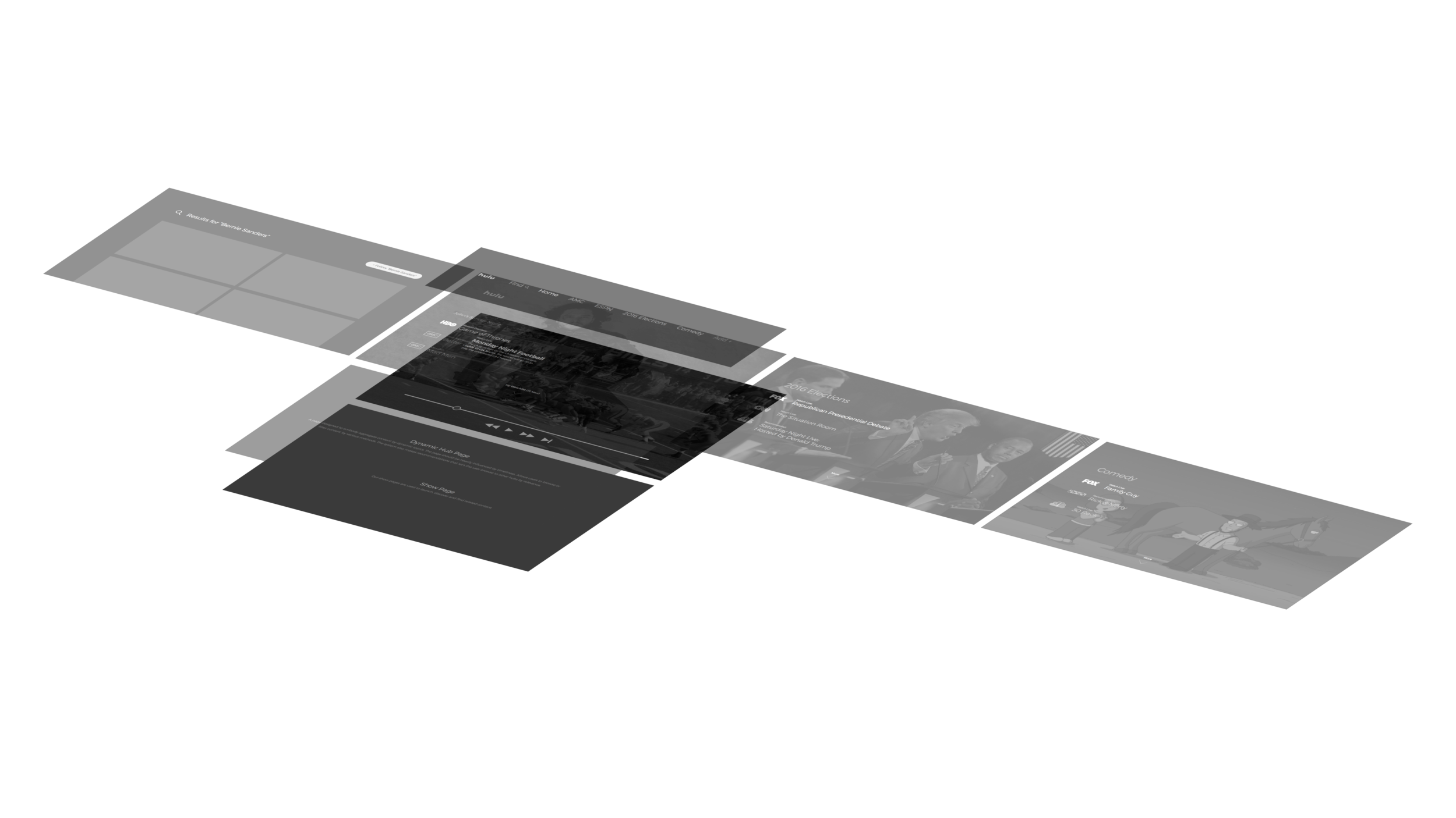
Interaction Model
Showpage
Player + Settings
Cloud Storage

A new interaction model
Insight: Cords are being cut
During 2016 the cord cutting movement was in full effect and a reported 5.5MM people moved to streaming only solutions. Brands like Netflix and Hulu were investing heavily in owned content and cable providers were scrambling to consolidate their online offerings.
Objective: Living room first
With a strong focus on streaming devices we wanted to deliver a strong living room experience. Because of the limited, sometimes cumbersome remote control it was important to start there and then move to the more flexible touch screen of mobile and tablet devices.
Insight: Content is king
Research between Hulu and Huge clearly showed that users don’t care about what platform their content comes from. The 14 day trial was actually a loss leader as 14 days was more than enough time for a user to binge the show they cared about and cancel the subscription.
Objective: Quality over quantity
Our primary strategy was to break the endless sprawl of content grids and to leverage Hulu’s recommendation engine to deliver the content users want in a focused way. This became a huge challenge when competing with the many complicated layers of promotions, brand agreements and content licensing.

Many years, many journeys
At the time Hulu had been around for many years and was a Frankenstein of many ideas from many owners and partners. Hulu was originally created as a way for NBC subscribers to watch their shows online, a log in was not necessary and there was a lot of free content to watch. Over time more content was added but so were more rules by the time streaming was taking hold and it was becoming more and more popular to “Cut the Cord” Hulu had become a confusing gray area of users, content, on-demand video, and many layers of subscription types. This all needed to be cleaned up.

A wholistic approach to content and user’s needs


Break the tiles


Direct to Show


Deep Browse


Details matter
With the reduced interactivity of the remote it was important to get the details right. We explored ways


Playback
We started by creating an intuitive navigation model that would reflect what a user expects from a TV interface while adding in special Hulu features in ways that felt natural.
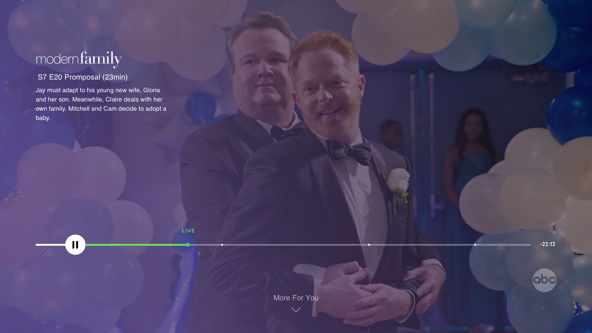
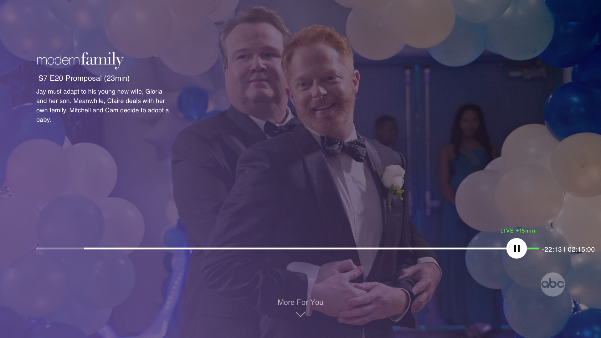
I focused heavily on the design and layout of the player UI. It was important to provide a simple viewing experience while allowing users to “flip” channels in a more efficient way.


Playback controls
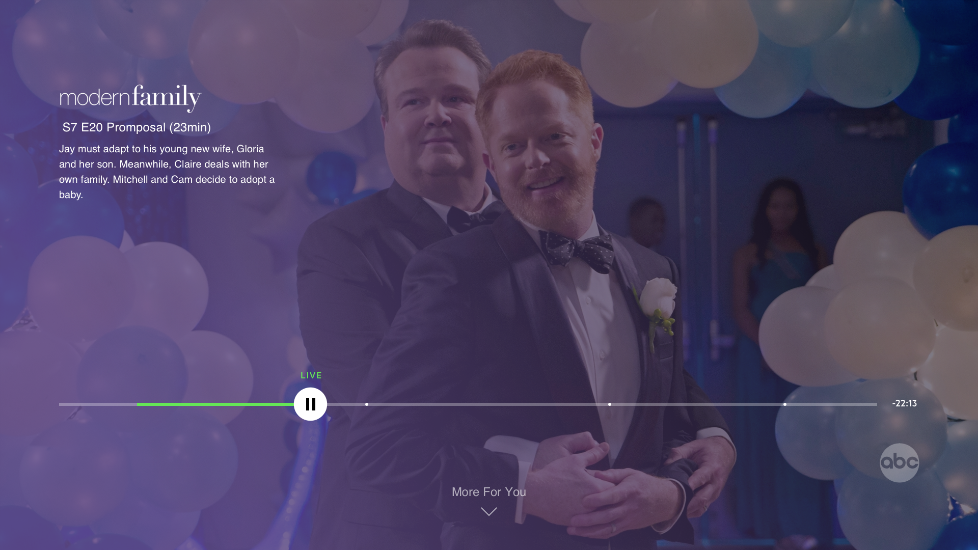
Channel Flipping
While designing the Player Pages it became apparent that a major part of Live TV was missing, How do you channel flip? I started asking myself this question and thinking about how we navigate media today. The literal up and down clicks still existed on our new remotes but ofter up was reserved for settings during playback, left and right were commonly used to scrub so down became an obvious choice.
It was apparent that there were two types of flipping:
Flipping back and forth
Another flipping that exists during live TV is that between multiple show that are occurring at the same time. If there are two sports games.
Exploratory Flipping
This kind of flipping occurs when a user is bored, or when a commercial comes on, it asks the question “Is there anything better on?”

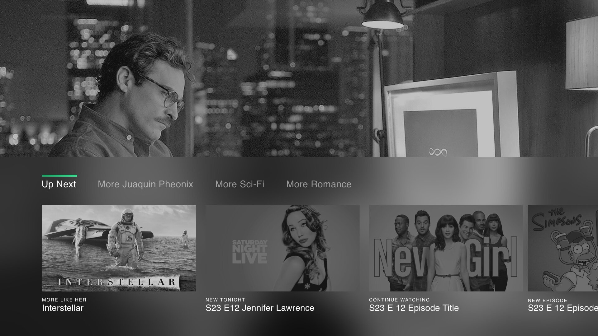

Enter the Flip Tray. We developed the flip tray to show you the systems best recommendation for what you would like to watch, keeping in mind that the last show you were watching may be that. This allows users to quickly pop back and forth between live shows, or completely pivot to another related show. We were able to use this same pattern as the end card as well to keep users in a familiar state and at the same time show off the usefulness of the Flip Tray.


Making it real
We made it habit to show off any new features to our team mates and clients frequently.
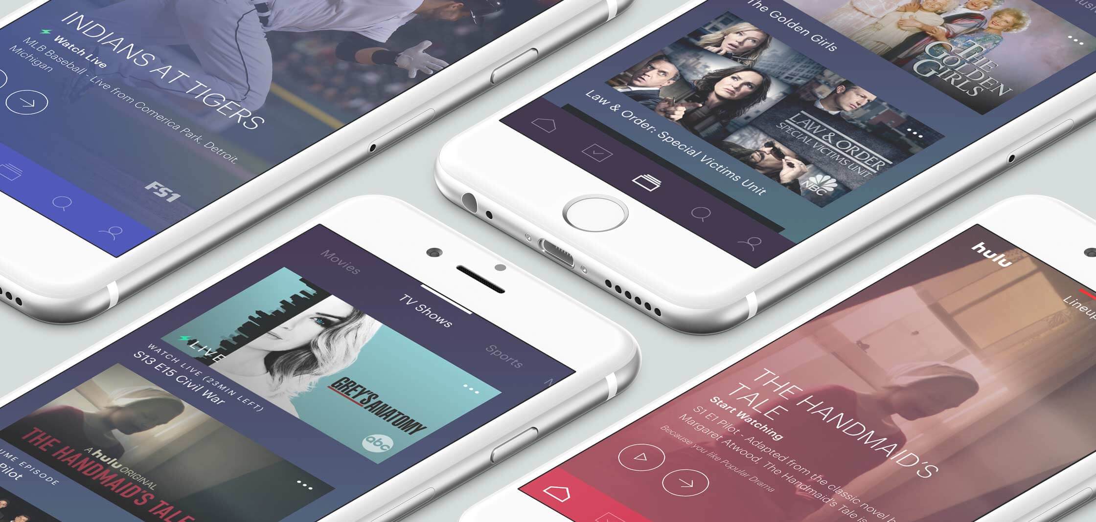
Mobile and Tablet
At the same time we worked hand in hand with the mobile design team to make sure we were creating an experience that translated across devices.

All grown up
“From the launch of the new platform Hulu has doubled its subscriptions (25MM total) and become the top live streaming platform.”
In late 2017 Hulu launched its new platform and today has secured more than 15 million new users. In 2018 Hulu beat out Crackle for the top spot of Live TV streaming platforms with 3 million subscribers. It is reported that 78% of Hulus views come from Living Room devices..